Health and Safety Issues when taking part in location based activities
When shooting in an outdoor environment there are many health and safety issues that should be taken into consideration when regarding personal safety as well as keeping your camera equipment undamaged. When considering personal safety it is always vital to pack a first aid kit before arriving at your location destination. In addition to this, it is always a good idea to wear sensible, sturdy shoes e.g walking boots, alongside spare waterproof clothing or clothing that juxtaposes with the weather conditions. Finally it is significant to always bring food and water especially in extreme weather situations e.g a heatwave. When considering camera equipment safety it is always helpful to create a check list of what equipment to bring alongside what will be protecting this equipment. The first most important thing to bring would be a sturdy camera bag to protect the camera itself as well as any detachable lenses which could also be of use. In addition to this, caps for your lenses and your camera are important to prevent dust getting clogged into the mechanics which could result in a distorted photograph on screen. For example I have experienced dust in my lens which created a dark black dot in all photographs that I took, this was easily resolved by using compressed air to clean the lens however previous appropriate planning could prevent this from happening in the first place. As long as these health and safety precautions are followed, nothing catastrophic should happen when regarding health and safety.
Basic Compact Camera Design
Advantages
Although limited, there are some advantages of a simple compact camera design compared to a DSLR. Firstly the main attraction to this type of camera is that it is easily portable and small enough to fit into hand luggage. In addition to this the main target audience is usually for the older generation who simply want to take photographs without any of the professional controls and complicated camera design. This means it is easy to use even for those who have a limited understanding of photography.
Disadvantages
It seems when comparing a compact camera to a DSLR the disadvantages overweigh the advantages, especially when the customer buying this product is interested in photography and are looking for professional frames. The main disadvantages of a simple compact camera is the poor lenses, which cant be replaced like a SLR as the lens is built into the camera. In addition to this compact cameras contain small, poor quality sensors which can cause digital noise on a photograph a lot more easily therefore reducing the quality of the photograph significantly. In addition to this the handing of a compact camera is quite poor as they are small and more difficult to hold in an upright straight position.
Compact Camera Operation
It is significantly clear from this diagram that there isn't a lot of technical information when it comes to a compact camera design. This generally appeals to the older generation because of its simplistic layout and easy use of the product.
Digital SLR Camera
As you can see from the diagram, in comparison to a simple compact camera, the SLR is a lot more complicated, advanced and for professional use. Unlike a compact camera the DSLR has a detachable lens to accompany the type of photography you are shooting at that time, for example if you were to capture a photograph of an insect you would use a macro lens.
Advantages of a DSLR
In comparison to a compact camera, the DSLR's advantages significantly over weigh the disadvantages. Firstly the DSLR has quicker shooting time, therefore it is easier to capture the perfect photograph you see right before you in time. In addition to this the photographs produced by a DSLR are much more clear, vivid and high quality in comparison to that of a compact. This also means that there is less digital noise in the photographs as the sensor inside the camera is much larger. Another advantage to a DSLR is that there is a faster focus and minimal shutter delay. Overall for a photography student a DSLR is much more reliable and what is needed for me.
Disadvantages of a DSLR
Although in comparison to a compact camera, a DSLR is generally looked at as better, there are some disadvantages to this design which may un interest certain target audiences One of these disadvantages is the size and weight of the camera, although it can be transported, the camera does not easily fit into hand luggage unless it is not appropriately protected. In addition to this it can seem quite difficult to use, especially for people with a limited knowledge of technology. Some simple tasks may seem more difficult as when shooting in Manual, each setting has to be set yourself according to what you want to achieve in your image. Finally one of the main reasons why some people would not want to invest in a DSLR is that because they have a big fancy camera, with not necessarily a lot of knowledge in photography, they feel the pursue of their peers to create a masterpiece with each frame they take, although in reality Photography is a very experimental topic.
Different Camera Lenses
When it comes to photography, the type of lens you use is significant to the subject in which you are actually photographing. Therefore close up photography would be shot through a different lens in comparison to if you were capturing a landscape view.
Standard Camera Lens
This is a standard camera lens that would normally come with your DSLR when bought in store. This type of lens is for all round general photography with an average focal length This type of lens is commonly used most commonly especially with amateur photographers.
The function of a Standard Lens
Wide Angle Lens
This is a wide angle lens for a DSLR camera. This type of lens is commonly used when shooting landscapes as more of the composition is involved in the frame, an extended view. With a wide angle lens a low aperture would give you a greater depth of field in comparison to lenses with a longer focal lens.
The Function of a Wide Angle Lens
Long Focal length Lens
This is a long focal length lens for a DSLR camera and is commonly used for photographing subjects in the distance therefore could be used in a wildlife shoot with animals that are too vicious to get close to, or even sport where you cant get as close as what you might want.
Paul M Smith is the first artist in which was given to research within the topic of Image Manipulation. Paul M Smith is a very famous and unique photographer who has a creative flare when working with Photoshop. He has a range of photographs which include multiple people within the frame, however all include the same person, he has experimented with this technique using himself and having a range of famous people modelling for him, for example Robbie Williams who appears in many frames created by Smith. To do this you have to set your camera upon a tripod and set your camera on timer, get in position and take a photograph. Finally all of these photographs can be layered on photoshop and rubbed out to create an optical illusion of the same person multiple times.
This is another example of a photograph created by Paul M Smith when exploring photograph manipulation. This photograph is an optical illusion and taken from an abstract angle combining male and female body parts together. Paul M Smith has a collection of interesting photographs showing nudity and sexual nature which some people may find disturbing however I find quite interesting and unique.
Practice Shoot On Image Manipulation
This was a first attempt at the process of image manipulation therefore the editing of this photograph is rather poor. However due to practice I now understand how to layer the photographs easily and not produce visible rubbing out tool marks from using Photoshop. From this photograph I also realised it was a lot easier and more visibly appealing if the positioning of each character was thought out to prevent overlapping of characters.
My Own Image Manipulation
This is my own image manipulation photograph. Before starting this shoot I decided that the main aspect in which I wanted to include when practicing this technique was to have a story behind my photograph as my practice shoot did not and seemed rather random and didn't interact in an interesting manner like I wanted. Overall I believe that this photograph was a success as the story behind the visual exterior shows passion and jealousy. However I were to recreate this photograph I would have chosen a different background situation to create a better appearance and theme to this image. However if I were to practice this technique again I believe I would shoot in an outdoor setting with natural light as the dim artificial light created lack of pixel detail due to an increased ISO.
Evaluation on Paul M Smith and My Own Image Manipulation
Overall I believe my own image manipulation was a success as I achieved what I wanted to show in my image although not generally enjoying the Photoshop technique. My main goal in this photograph was to create a story behind my image as I wanted it to make sense and have meaning. My inspiration came from watching a television programme named 'Don't Tell The Bride'. I thought it would be a humorous idea to have multiple versions of me recreating the story of proposal. Therefore in my image there is a man proposing to a woman, a camera man and a jealous ex. For this multiple outfit change was needed to create a more realistic appearance.
Mono stroke Black and White
This is a photograph which I captured and edited using the technique of Mono stroke Black and White. I created this effect of mixing black and white with colour in the photograph by using Photoshop. This technique creates a focus point of the photograph by enhancing the vibrance within one part of the rule of thirds. The technique of this effect is quite easily done just by creating two duplicate layers, one with the photograph in colour and one in black and white. After this the rubber tool is used to rub parts of the black and white photograph away to reveal a colourful background appearance, this gives you the opportunity to reveal parts of the photograph you wish to be in colour. Finally the opacity of the black and white background is increased to create a greyscale appearance with a hint of dull colour to create an interesting contrast. Although some people created a more vibrant colour amongst the black and white tones, I believe by using pastel colours works better when creating an atmosphere with the black and white in a photograph. Therefore that is what I did.
Evaluation Of Mono stroke Technique
Overall I do enjoy this technique using photoshop as I believe it can make a photograph come to life and be more appealing to the eye. I have used this technique before however at the time it was named 'Colour Splash' therefore I was already familiar with the technique and had no problems when creating this edit. With this technique I think it is always appealing and interesting when juxtaposing a low aperture with the mono stroke technique.
Warhol
For this part of the Image Manipulation unit we each created a photograph in the style of Andy Warhol. Andy Warhol was idolised and recognised for his photographs for being very vibrant in colour and showcased in a grid. Within this grid the same photograph is placed in each grid however in different colours to contrast each other creating an interesting and busy overall photograph.Overall I have never really taken inspiration from Andy Warhol's work, however I am happy with the outcome of my photograph which is in the style of Warhol. I believe the effect of using a light haired and skin model created an interesting contrast when edited and the use of texture is enhanced effectively.
Evaluation Of Warhol Editing Technique
Overall I wasn't particularly inspired by the 'pop art' style of photography therefore although I am pleased with my photograph and do think it looks interesting, I wont be following up or experimenting further with this method of editing. I think I am mainly not interested in this style as I am particularly attracted by black and white photography with deep contrasting tones and full, sharp detail within the human form.
Vignette
For this section of the Image Manipulation unit we experimented with the technique of Vignette. This is also done on photoshop fairly easily and can create an interesting composition within a dull un interesting photograph. For this photograph I decided to capture my model with perspective significantly shown amongst a busy background, from this I could then enhance the focus point of my model by creating the Vignette boarder around him. The technique of Vignette on Photoshop is quite similar to the Monostroke Black and White effect, however with the use of a boarder as well. When editing this photograph I decided to create a thin white boarder to create a 'doorway' of light appearance.
Evaluation
Overall this was a new technique which I haven't experimented with before therefor it was quite interesting to see what the final result looked like. I do believe this editing process is interesting and would like to develop this further however I dont like my final image as I think it is a bit pointless and lacks meaning and emotion.
Ten Years Younger
For this part of the Image Manipulation unit we were given the topic of 'Ten Years Younger'. In this we had to photograph a person over the age of 50 which in result could be air brushed to create a more youthful and radiant appearance. This technique was easily done using Photoshop where I used the 'Healing Brush Tool' as well as the 'Spot Healing Tool'. In result by using these tools my models complexion became smooth and unblemished. Using these tools with the occasional use of the 'Clone Stamp Tool' I erased my the bags underneath my models eyes, his laughter lines, wrinkles and unwanted facial hair. Finally to complete the air brushing process I chose to put an overall blurred effect upon my photograph to produce an event softer, more even skin tone.
Evaluation
Overall I did really enjoy this exercise as I think it is very interesting how the appearance of an individual can change so much due to altering their complexion and 'imperfections' which they have due to age. I believe my final photograph is successful as it is a realistic change in identity and the airbrushing looks natural and not extreme. Generally in photography I enjoy photographing the human form, therefore this process could be very useful to me if needed, however I do like the appearance of ageing skin in a photograph as i believe it adds texture and character to the individual.
Creating Reflections In Photoshop
For this section of the Image Manipulation blog we experimented with creating a reflection on Photoshop. Firstly we took a photograph of some water alongside another separate photograph of a building. Unfortunately I didn't capture the building with enough space to show a significant reflection however the technique is still slightly shown in my final image.
This is my final photograph showing a reflection created by photoshop. This technique was quite easy to do however some difficulties can arise if your photograph wasn't planned very well. In this case I should of captured this building with a lot more space on the floor to create a significantly visible reflection. When opening Photoshop my first step was to cut out the photograph of the building using the Lasso Tool and pasting it on a background layer. After this I then dragged the photograph of the water onto my photograph. When this step was complete I then used the Rubber Tool to rub out any of the area in which I didn't want covered by water. Finally I lowered the opacity of the water and created a reflection by selecting the building and rotating it vertically to create the illusion.
Evaluation
Overall I did not enjoy experimenting with this technique as much as I thought I would. The style of photography which I am inspired by doesn't tend to include techniques such as this, however I believe if I were to experiment with reflection again, I could create a lot more interesting and successful photographs. Generally this technique was quite easy to do on Photoshop however I did have to overcome some problems during the process of editing. For example I had to rub out certain parts of the photograph which didn't look correct with water over the top, also the reflection of the water isn't lined up perfectly as id like it. Although the reflection is slightly wonky, I decided to improve the appearance of the photograph by adding transparent ripples to the water. Therefore I believe I was successful at this skill and overcame any problems I had. If i were to practice this technique again, I believe my final photograph would be much higher quality and potential.
Creating Snow In a Photograph
For this part of the image manipulation blog we were given the task to change a normal sunny landscape into a winter scene by only using photoshop. To make this process more effective we captured a landscape which included greenery. From this you then select a mid grey colour, mainly found in the trees, to start a base for a snowy scene.
The Process of Creating This Effect
1)Press Ctrl/Cmd and J to create a copy of your photograph.
2) Using the eyedropper tool select a mid grey colour, usually found in grass or trees.
3) Then click on Select>Colour range
4) Use a fuziness slider of roughly 132 and choose sampled colour from the select drop down box and click OK.
5) Add a new layer (ctrl/Cmd+Shift+N) and name it snow.
6) Go to Edit>Fill and choose white for contents.
7) Then hit (Ctrl/Cmd+D) to deselect.
8) Now in the layers palette, change the blending mode of the snow to 'Hard Light'.
9) Add another layer (ctrl/Cmd+Shift+N) and call it gradient. Using the colour swatch and choose a vibrant blue.
10) Select the gradient tool and click in the gradient picker.
11) Choose 'Foreground to Transparent'
12) Using your cursor, click and hold from the bottom of your image and drag vertically from the bottom to the top.
13) Now set the Blending mode of the layer to 'Hue' and change the opacity to 80%.
14) Add another layer and name it Snowfall.
15) Fill this layer with 50% grey (Edit>Fill) 16)Hit 'D' on the keyboard to make Black the foreground colour
17) Add noise to the image (Filter>Add noise)to 50% 18) Choose Gaussian for distribution and check the monochromatic check box. Click OK. 19) Next, Filter>Blur>Gaussian blur. Use a blue radius of between 3.5-5. 20) To adjust the contrast of this layer go to Image>Adjustments>levels. 21) In the levels dialog box drag the pointer to the peak of the histogram chart. 22) Now drag the black pointer so it starts to disappear behind the white pointer. Click OK. 23) Set the blending mode to 'Screen' and reduce the opacity until the snowfall is more realistic in appearance. 24) Now to create the illusion of the snow being windblown go to Filter>Blur>Motion Blur. Use an angle of 65 degrees and a distance of around 13 pixels.
Original Photograph
With Snow
Compare and Contrast Two Photographers Who Manipulate Photographs
Lydia Marano
Lydia Marano is a photographer who is known for her interesting imagery and techniques within the topic of photograph manipulation using photoshop. The type of imagery she tends to create includes a range of layered images containing deep contrasting tones of typically black and white or sepia colour cast. I generally really like this photographer and am quite inspired at here unique 'dark' view upon the world. Her work ranges from dark and mysterious to sometimes quite comical therefore she demonstrates various different photographic and editing techniques to reflect the mood in which she may feel at the moment in time.
This is one of the photographs in which I particularly like by Lydia Marano. This photograph has two layers however are combined together to create the illusion of a real life face created by clouds within a storm.
This is another photograph created by Lydia Marano which I particularly like mainly due to the unusual composition alongside a slight 'vintage' appearance this was clearly done on Photoshop with a sepia overlay. In addition to this I also like the darkened corners to this photograph as it makes it look older. Although I do love this photograph it isn't the type of photography I am generally interested in, as I am not extremely fascinated in photograph manipulation, however usually find the outcomes very appealing.
Erik Johansson
Erik Johansson is a photographer and also a retouch artist from Sweden who uses photography to demonstrate the ideas in his mind but on a smaller scale. He is known for not only his own projects but also commissioned work alongside creating street illusions. He mentions on his online blog that although his photographs may have hundreds of layers he always wants to edit carefully to give the photograph an appearance as if he shot it there and then.
This is a photograph created by Erik Johansson where the use of photograph manipulation is very clear. I really like this photograph as it is interesting to look at alongside the story created by the image. I dont normally like photograph manipulation however I do find images interesting if they create a story behind the pixels. It is clear from this picture that Erik Johansson tried to recreate the feeling of mystery and fear that lurks at the bottom of your bed at night time. To do this he captures a photograph of both in his bedroom juxtaposing with a murky forest created from the flow of a bedsheet.
This is another photograph created by Erik Johansson within the topic of photograph manipulation. I have also experimented with the technique shown in the photograph previously, however interesting, I believe it could have been more effective if the picture was shot from a side angle to show a different reflection to what is staring in the mirror. However the crisp detail and composition within the rule of thirds is quite effective.
This is another photograph created by Erik Johansson. This image appeals to me as I am very interested in using the technique of reflection within a photograph as it creates a busy and abstract style. I like how Erik has entwined the use of reflection to create an appearance of water juxtaposing with himself in the frame holding a mirror. This creates a very interesting and clever optical illusion.
Evaluation Of Compare And Contrast Photographers Who Manipulate Images
The two photographers I researched were Lydia Marano and Erik Johansson. Although both experiment with the technique of image manipulation their general style of photography is very different. For example Lydia Marano mainly produces photography with a mixture of distorted human form and animals whereas Erik takes a different approached of mainly focussing on many layers on photoshop to then edit together to create a final very interesting image which often includes multiple people in his frame usually being himself. Inn addition to this Lydia's general style is quite dark and mysterious compared to that of Erik Johansson which mainly consists of more 'clever' photographs. Although interested by both photographers, I believe my preferred photographer out of the two is Lydia Johannson as her images are deep, dark and interesting.
Selfie Montage
For this part of the Image Manipulation unit we were given the task to create a 'selfie' montage. For my shoot I decided that I should create a theme to my photographs. For this I started to brainstorm my ideas and then chose to shoot my images when I was non sober. This mant I wasn't posing for my photographs and created a humorous exterior.
Digital Slideshow
For my digital slideshow I believe the most important thing to include is a theme to my photographs as I want to prevent a random compilation of photographs that don't link together. So what I began to do in this topic was a mind map to think of a theme for my slideshow which I could eventually take a lot of images to fit within a chosen theme to last at least 3 minutes accompanied by music.
Photography copyright is the photographers right to own their photograph to prevent other people or companies from using the artists work without permission and consent. The law of copyright came into action when it was stated that a photograph is classified as a piece of art, therefore is owned by the artist in which captured it.
Who Owns The Copyright of a Photograph?
The copyright of a photograph is usually owned by the artist in which captured the photograph, however if the photographer is working for a company or agency that means the photographs in which are being taken for that company is owned by the company.
How Long Does Copyright Of a Photograph Last?
The copyright of a photograph lasts for 70 years after the date of the photographers death, after this the copyright has expired and is no longer owned by the individual or company in which previously asked permission.
How Would We Infringe The Copyright Of a Photograph?
It is very easy to infringe the copyright of a photograph simply by including other artists work in blogs or portfolios without asking permission from the artist. It is illegal to use work created by someone else and presenting it as your own, however this crime has happened before.
Example of Where Copyright Infringement Has Occurred
A famous example of copyright infringement was Cariou vs. Prince. Richard Prince is a well known artist which works within the topic of appropriation art, meaning that he takes old art and recreates it to make a new meaning. However when Prince posted 41 images from Carious book it was strongly argued that this was a vital case of copyright infringement. In this case it was ruled in being in Carious favour which caused great diversions within the art community.
How Can We Legally Copy Photographic Images?
There are various different ways to legally copy images from an artist, however the main way is to gain permission from the original artist to use their work. However if an individual has excessively searched and tried to get in contact with the original artist but gained no response, with proof of their effort, the photograph can then be considered as 'An Orphan Image' which gives the individual the right to copy the artist image without consent.
How Can We Protect Our Own Images From Being Copied and Used Commercially ?
There are various different ways in which you can protect your images from being illegally exploited, however the usual action of doing this is to 'Watermark' your photographs. Watermarking an image involves a faded piece of text over your image stating your name, date and the copyright symbol. This prevents people from copying your images as it is hard to remove a watermark and involves great time and skills on Photoshop.
An Example Of a Watermarked Photograph
When creating a watermark it is ideal to have the writing set at a low opacity to prevent ruining the actual photograph. It is also essential to place the writing over a section of the photograph which would be difficult to be eared using Photoshop. In this Photograph I did decide to place my watermark in the middle of my image, however I placed it in a location of deep textual detail to eliminate the option of editing out the writing. I also used very low opacity of 15% therefore it doesn't ruin the photographs appearance.
Dr Martens Jeans Assignment
For this assignment we are focusing on advertising Dr Martens Jeans using our own photographs and text to create a branded promotion poster. Before beginning my own shoot showing Dr Martins jeans it is vital I research other adverts and videos which also promote Jean products. Once I have researched other adverts I can then begin to draw up my own plans before shooting photographs for my poster.
About Dr Martens
Dr Martins is a large and recognised brand which produce both women and men's shoes alongside a small clothing line with a model named Agyness Deyn. The style of clothing and shoes mainly consist of urban street style with a rock style edge. The majority of the clothing line is quite simple in style however contain edgy twists to create a unique appearance. From visiting Dr Martens website ,the clothing also tends to be made from high quality material which in result costs a lot.
This is an example of a piece of clothing on the Dr Martens website. This woman is modelling a 'Tshirt Dress' which appears to be a twist on a ordinary Tshirt. The effect of using a pretty, ordinary girl is significant when contrasting with a more edgy style. Therefore by doing this it opens up a market audience of all types of women and demonstrates how Dr Martens clothing can give you that hint of edge.
This is an example of the type of shoes/boots that Dr Martins are very popular for. This shoe is quite plain in comparison to some of the shoes they have in stock which consist of bright colours, pasterns and waterproof material. These shoes are quite industrial in appearance and can be significant to creating the perfect style Dr Martins is promoting within an outfit. Therefore in my own shoot I will consider footwear to reflect that style.
Other Jean Advertisements
Levi Jeans
Another very popular brand of jeans which have interesting photography within their advertisements is Levi'sjeans. This brand has been well known for years and the style of advertisement tends to fall into a more casual and general category of appearance. Therefore by doing this they have targeted most people into the market by not focusing on one main type of style jean.
By promoting everyday well lasting jeans with a different style to fit you, a lot of Levi's advertisement posters focus on a close up section of a pair of jeans with the brand name large and visible. By doing this it draws attention to the viewer as well as enhancing the quality of the jeans by using a close angle along the seems and material.
However this is an example of a more staged composition using photographic techniques such as rule of thirds and low aperture setting. The target audience for this advertisement is mainly for aged 16-25 in a 'Him&Her' collection. From this research I have come to the conclusion that I will photograph both male and female models to provide an advertisement for both sex.
Jean Commercials
This is an example of promoting jeans by a digital advertisement (commercial). This commercial is promoting Armani Jeans. This brand tends to use handsome men and beautiful women to enhance the 'magical powers' these jeans will give you if you were to buy them. The commercial implies that you will be irresistible to women if you were to have these jeans. This will therefore attract young and old, handsome or not men to buy these jeans.
Similar to Levi Jean advertisements, Armani decided to use the theme of 'Him&Her' when creating commercials for their jeans. This commercial features Megan Fox which is an idol and a very popular attraction to male audiences. The use of both commercials involving famous and attractive main characters will catch the eye of both female and male market.
My thoughts Before Shooting My Advertisement Poster
Before shooting my own jeans advertisement, from the research I have done, I believe that the theme of 'Him&Her' is an essential selling point, therefore I will be photographing advertisement for both men and women. For my photographs I will also use a typical girl and boy however with certain edgy twists to juxtapose with the Dr Martins clothing line appearance.
My Photographs For Female Jean Advertisement
This is one of my best shots for the Jeans advertisement in the 'Her' collection. I decided to capture this image with jeans that have character and edge, which I believe is shown by the rugged ripped look on the over sized jeans.I like how the model is positioned and the blurred background, however I could have improved this image by using a higher aperture to get everything in focus however still blurring the background slightly. I decided to capture my model outside, with natural form and hard rocks in the background to show a street/industrial tone to the photograph.
This is another one of my favourite photographs in the 'Her' section of my Dr Martins Jean assignment. In this photograph I have used black and white tones to enhance the detail of the jeans and create a classy yet edgy appearance to this advert. I have also taken inspiration from Armani Jeans in using sex appeal to attract the audience, this is shown by the piercings and slight peek of the models underwear which attracts the viewer to look around the area in which the jeans are placed.
For this photograph I decided to take inspiration from Levi Jean advertisements by using bright contrasting colour and close up, interesting angles. I also decided to capture tight fitting jeans to show the sex this advertisement is aiming the market to. This photograph only contains the jeans in this photograph therefore it is quite significantly clear what I am promoting with my photograph.
My Favorite Shot From Female Jean Advertisement
This is my favourite photograph demonstrating what I believe an advert for Dr Martins Jeans would look like for a female market. For this photograph I chose over sized light coloured jeans with a hole and rip to add an edgy style and character. I also decided to focus on the shoes in which would be included in my advert as Dr Martins are most famous for that side of the market. Although I did not own any Dr Martins shoes to involve in my advert I was able to use industrial styled footwear on my model in a colour that fits the gender of my target audience.
My Photographs For Male Jeans Advertisement
This is one of my favourite full body shots for the male Jeans advertisement. I have photographed my model with the same background as my female model to provide a 'Him&Her' theme. I believe this photograph provides an edgy style to juxtapose the Dr Martin style. However I believe this photograph could have been improved by getting more of the jeans involved in the frame as the focus fades off them slightly. I may have also used a slightly lower aperture to blur any background distractions to draw focus to the Jeans. However I do believe the composition of the photograph is interesting.
This is one of my favourite shots from the Male Jean Advertisement. Similar to the female shoot I decided to edit my favourite close up photograph in black and white tones. I believe the composition of the guitar with the tattoo upon my models arm provides a rocky and edgy theme to the photograph which demonstrates what I believe Dr Martins Jeans would appear if they were to be included in the clothing line.
This is one of my favourite shots from a backwards angle in my male Jean advertisement. This photograph is juxtaposing with the female shoot from behind however the angles of the photograph are different, they both contain contrasting, deep colour. If I were to improve this photograph I would move any background distractions from the composition as well as using a slightly lower ISO as some digital noise is significantly visible.
My Favorite Shot For Male Jean Advertisement
This is my favorite shot from the male jean advertisement shoot as I believe the close up angle demonstrates clearly what is being advertised and the gender in which it is for. Although digital noise is visible from the ISO being too high, I do believe it does give the photograph character and texture to fit with the rugged rocky and edgy style. In both female and male best shots I decided in keeping both photographs in color to link in nicely together.
Adding a Logo To My Advertisement
When creating an advertisement it is vital to include the company logo on the photograph in visible sight to show the viewer where your product is from. However some logo's may distract the viewer from the product focus point therefore this can be adjusted by lowering the opacity to create a faded logo that is still visible.
In this photograph I decided to put the logo in the bottom right hand corner, similar to my other best shot, however I faded this logo as it was a distraction to the rest of the photograph. When adding this logo to my photograph I had to use the magnetic lasso tool to discard the white background of the Dr Martens logo, to prevent any distraction on my advertisement.
Evaluation Of Jeans Assignment
Overall I did enjoy the Jeans assignment as my favourite type of photography includes human form. It was also quite interesting to shoot something for an advert as you had to think about the focus point and how to make the Jeans look appealing. I believe the Him&Her theme works well together and have understood from my research that it is a vital and successful selling point within the clothing industry. I also believe the female shoot was a lot more successful as the photographs are more crisp and detailed, whereas some of the male photographs have been set on a ISO which is too high which therefore effected the photographs quality which is vital when shooting something for an advert. If I were to redo this assignment I believe I would have experimented with different compositions and shot my male and female model together as I believe that would make an interesting effect and selling point.
Mshed Wildlife Photographer of The Year Report
On Wednesday the 3rd of December I visited the Mshed where the Wildlife photographer of the year exhibition was taking place. Amongst a variety of photographs the gallery was divided in a unique way with wildlife themed games and real animals and insects behind glass boxes to view up close. This was visually appealing and enhanced the attraction of the wide collection of wildlife photographs. The use of a sectioned room increased a sense of adventure which created a strong theme to the exhibition which is vital when displaying work.
Photographs I Liked
When entering the Mshed Wildlife Photographer of the Year exhibition my eye was naturally drawn towards this particular photograph. I mainly like the use of high aperture and blurred rich colours within this image whilst showing some aspects of striking crisp detail, for example within the rippled water. I also like to experiment with high apertures in my photographs as I believe the final piece is usually quite eye testing and interesting, I believe this artist would have used an aperture of around f4 therefore creating a shallow depth of field, drawing focus into the left hand side of the rule of thirds, bringing attention to the eye of the toad, which in conclusion is the name of the photograph. This photograph was captured by a photographer named Lucasz Bozycki whom of which wasn't frighted to get stuck into his work, and connect with that in which he is photographing. When capturing this photograph Bozycki sat in icy waters until the toads were content with his presence, the result being a calm and non staged photograph taken when the sun was setting and glistening gracefully upon the waters edge.
This photograph was another of the wide variety of artwork in which captured my interest and attention. This piece is named ice aurora and was photographed by an artist named Ellen Anon. This image mainly captured my attention due to its mystical appearance and use of reflection within the image. I find it incredibly inspirational how this was captured without any editing on Photoshop yet shows an almost artificial and computer generated appearance. This photograph was taken when the northern lights where lit over the horizon above the icy stretch of still water. At this point Ellen ran with her camera and tripod and captured this is one shot, with a wide angle lens and and a low aperture of around f22, in result a magnificent outcome of crisp detail and rich tones and texture .
This is one of the photographs in the exhibition in which made me realise the beauty that can be captured when using a fast shutter speed to freeze all movement and create extraordinary detail within an image. This photograph is named 'Sock eye catch' by a photographer by the name of Valter whom of which had to wait for the precise moment to capture such an excellent shot. Normally in my own photography I don't inspire or enjoy experimenting with shutter speed very much but after seeing this image and the appearance of water when completely frozen still in time made me realise the great effects it can create, in result makes me want to experiment with this effect more often also. In addition to the vast amount of detail in this photograph I also like the use of a medium aperture and depth of field to create a blurred background therefore enhancing everything in the foreground to the viewers eye.
Most Inspirational Photograph- Wilflife Photographer of the Year
This is one photograph within a collection created by Brent Stirton showing the process of ivory and the emotional and natural destruction it can cause. Within the exhibition this topic named 'Gods Ivory' was displayed by showing 8 photographs taken by Brent in chronological order to tell a story of how ivory is used and where this material has originally come from. Alongside the photograph was placed some information of the photographers travels and his personal experiences when taking part in this horrific project. This was such a success that Stirton won 'Photojournalist' of the year. I was mainly inspired by this work due to the appearance of a story through the media of photographic collage in chronological order, as well as the emotional response in which it could cause. I was able to connect with this work and feel the emotion in which the photographer is trying to demonstrate through digital media. Myself as a photographer is interested in photographing the reality of life around the world therefore this really spoke to me and struck my attention. From this piece of work it has sparked interest in my mind to research and practice photojournalist techniques within my own work.
Photograph I Did Not Connect With
This photograph was in the 15-17 years section of the exhibition. Although for the age of this contestant, the photograph is quite a success as it got chosen to be represented in the exhibition to potentially win a prize, in my opinion i don't think it shows much potential. I like the use of a fast shutter speed to freeze the movement of this creature however personally i much prefer photographs which contain a story behind the pixels, however for me this photograph springs to mind a lucky shot for a first time visitor to the location in which these creatures live. This may not be the case but personally i found it hard to connect with this photograph as it didn't emotionally move me or grab my attention in a unique manner.
Photograph I Did Connect With
15-17 Years
This photograph was also included and entered into the Wildlife Photographer of the Year exhibition amongst others ages 15-17 years. For me this photograph is much more unique and eye catching with a slight disturbing theme and manner due to the certain camera techniques in which this individual has decided to use. I mainly like the use of a high aperture, with a camera shook appearance layered behind the crisp detail of this creature as it creates a slightly psychotic feeling to the whole exterior and meaning of this photograph, the phrase survival of the fittest springs to mind when i look upon this creation. In addition i also like the use of white, black and green tones complimenting the bird in this photograph to enhance the busyness of the image without destroying its brilliance.
Evaluation of Wildlife Photographer of The Year Exhibition
Overall I did really enjoy the Wildlife Photographer of The Year Exhibition as I believe it included some outstanding photography. I particularly liked how each photograph was very different when capturing animals as well as wildlife. My main inspiration and goal in which I want to reach in the topic of photography is to create my own style to my images to be recognised for my own techniques and skills in which i choose to work with. This exhibition truly showed each photographers mind set and techniques when capturing their photographs and this inspired me and broadened my mind to see other photographers artistic eye and style, I believe this enhanced the competition standards as each photograph includes different techniques contrasting with one another. In comparison to the Taylor Wessing Portrait exhibition in which I previously visited, I believe both exhibitions showed potential in different aspects. For example I believe the layout of the Wildlife Photographer of The Year exhibition was cleverly thought out including interaction in the form of games and puzzles amongst the photography therefore more interesting and visibly appealing. However on the other hand in terms of photography I did prefer the Taylor Wessing Portrait of the Year Exhibition as I like a story behind photographs and i believe that is best demonstrated through human form. If I were to improve the Wildlife Exhibition I would group the photographs according to the type of creature in the image and place them together in a group within one section of the exhibition. For example all photographs of sea creatures would be places together in one corner of the exhibition and decorated differently, vice verse with other creatures and landscapes as I believe it would create a more interesting and set theme to the exhibition.
24 Hours in Bristol Exhibition Report
When visiting galleries in Bristol, one of the galleries in which I visited due to the high potential of photography was The Guildhall '24 hours in Bristol' exhibition. The concept of this interesting exhibition was that everyone within Bristol who entered, was given the opportunity to capture an image within a 1 hour time slot. In result this exhibition was full of various images shot in Bristol at all different times of the day and night. The composition of the photograph was entirely up to the photographers creativity as long as it showed evidence of being captured in Bristol. The reason which I connected so much with this exhibition was that you didn't have to be a well recognised photographer to enter your work, this gave individuals in Bristol the chance to unite and present the outstanding levels of creativity that the city has to offer. Overall this exhibition was offering 3 main prizes. For third place the contestant received £500 cash, for second place £500 was awarded as well as a voucher for London Camera exchange worth the same amount and finally first place was given £3000.
First Place
This photograph was captured by Andy Coffin and was awarded first prize in the 24 hours in Bristol exhibition. This photograph was taken at Temple Meads train station and given the name 'View of the cycle park on the station platform'. I do really like this image as I believe the cluttered composition of the cycles creates a strong texture and an intriguing blend of colour. In addition to this I am also inspired by the angle which this photograph was taken from juxtaposing with the low aperture and rounded boarder created by the building ceiling. This shows photographers anywhere that something that is not usually considered as art or beauty can be captured in an appealing way from the type of photographic techniques you decide to experiment with. I believe this photographer was a worthy winner however in my opinion my taste draws my eye to other work which was entered into the competition.
Second Place
This photograph was awarded second place in the exhibition of Bristol and was captured by an individual named Rich Perrin. This photograph was taken at a 1am time slot at the bottom of Park street and combines the use of graffiti and light painting to create a unique appearance. The use of light painting demonstrates the paint in which is sprayed out of the can giving the picture more character and attraction, enhancing the vibrant graffiti even further. Overall I do like this photograph however It isn't the style of photography I am normally attracted to. I believe the use of light is interesting however I do not like the possession of the individual holding the can or the colour which the paint is shown as it creates a very unrealistic and less meaningful photograph.
Third Place
This photograph was given third place in the competition and was captured by a photographer by the name of Martin Urmson. This photograph is clearly taken at night and was given the name 'Old Docks Cottages'. I really like this image mainly because of the creative use of lighting and perspective in the image. I believe the use of reflection in the water adds to the angle of the photograph nicely, enhancing a clear perspective guideline alongside the control of a low aperture to create an all rounded well constructed photograph. Although I am not as interested in Landscape photography in comparison to human form portraiture, I am still very inspired by this photograph.
Photographs I Liked
This photograph was taken by an individual named Luke Walker and submitted this piece with the title 'Graham'. Because I have a passion for black and white photography, mainly in the topic of human form and street people , I really connected with this photograph due to its deep contrasting tones, texture and the story behind the pixels. The man in the photograph is a homeless writer who is often located in Bristol, handing out his personal newsletter. This photograph highlights the very diverse mixture of people found in Bristol highlighting the cultural experience within the city. I love how he is still smiling in this photograph although his life is far from perfect. This intrigues me when thinking that you cant tell someone's pain behind a masked smile.
This is another photograph in the 24 hours in Bristol exhibition which I particularly liked. It was captured by a photographer named Kinlay Burns. What originally drew my attention to this photograph was that it was taken in a reflection of a car mirror. Reflection in photography is one technique I love experimenting with as I believe it gives the image character and an abstract appearance, creating something more diverse and interesting in comparison to taken a photograph in the natural manner. I also like the use of black and white photography that isn't overly edited and the photograph is very real and raw, it hasn't been captured and scanned through Photoshop to create a more 'perfect'appearance. This is Bristol.
This photograph is another which caught my eye and interest. It was taken by an individual named Virginia Allwood in early hours of the morning from Old School Lane, Hotwells. When capturing landscapes I love to experiment with silhouette and deep contrasting clouds with beams of light in the background. Therefore I love this photograph and am very inspired by it. There are strong significant light beams n a linear pattern along the landscape which draws your attention to then explore the rest of the composition. Although I don't believe this photograph represents Bristol as a city in general, it does offer a look into some of the cities beauty.
Photographs I Didn't Particularly Like
This photograph was entered in the 24 hours in Bristol exhibition by Jayne Burton. Although the composition of this photograph is quite nicely thought out and provides a peaceful vibe, I don't believe it shows much creative photographic technique. Overall I think that this competition should have included photographs that sum Bristol up as a city and I don't feel like this image does that. It appears quite armature however everyone has a right to enter work of their taste.
This is another example of work submitted into the exhibition which I didn't gain much inspiration from. This image was entered by an individual named Sue Atkinson. Although I do like the natural non staged composition, I do believe this photograph could have been captured in a more interesting manner. For example if this photograph was captured from either low down upon the floor or from one side of pathway, perspective could have been created in the image in a more attractive abstract form. Another way this photograph could have been more effective is if the people in the frame were captured with the light in front of them creating a 'glow' effect around their bodies alongside the vibrant trees in conclusion creating a 'light' and joyous theme to the streets of Bristol.
Evaluation of 24 Hours in Bristol Exhibition
Overall I really enjoyed the 24 hours in Bristol exhibition as I thought it was a very interesting and unusual concept for all individuals to be involved in. I believe it was a great opportunity for unknown creative people to represent their outstanding work and have a chance to win a prize in return. The exhibition itself could have been spaced out a little differently however in my opinion as the photographs were hung in a very cluttered manner, taking some attraction away from work that should have been clear to see. In addition to this the lighting in the hall could have been altered as a yellow glare shone upon some frames, making it quite difficult to see at times. As for the winners of this exhibition I believe each place was well deserved because of the high potential of photography demonstrated, however due to my own taste within photography I would have chosen different winners. However on the other hand I do believe the finalists of this exhibition did capture an image which represented what Bristol is about perfectly. To conclude this exhibition has inspired me to travel Bristol and find different parts which I could photograph myself as there is beauty and art lurking around every corner.
Digital Manipulation of Photographs and Its Morals When Used In Advertisement
Digital manipulation of photographs occur very frequently throughout day to day life usually without any notice given. Photoshop is an editors necessity mainly occurring in advertisement for brands for example a clothing line or make up advertisement for a magazine, this process is called air brushing. Air brushing is when the editor of the photograph blends in any blemishes upon the model and usually will slim down the individual to make a more desirable and what is looked upon as a more 'perfect' appearance.
Example of Photograph Manipulation In a Magazine Advertisement
This is an example of an airbrushed and non airbrushed photograph of Kim Kardashian. The magazine in which this photo shoot was meant for accidentally published the wrong photograph (non airbrushed) and was viewed all over the internet and created a media storm. When both photographs are side by side it enhances how much of the photograph has actually been changed and edited to be more 'perfect'. In the airbrushed photograph it can be easily detected that the models body frame has been significantly trimmed down as well as her skin being lightened and unblemished for an all over even appearance. The background of this model has also been lightened to enhance her beauty and for the focus point to be upon her.
Example of Photograph Manipulation In The News
This is an example of where photograph manipulation has been used in the media and public eye. In this circumstance this is seen as morally wrong and has been described as a controversy as it is related to a very serious matter in the form of a news report. It is clear that the original photograph has been airbrushed to an unrecognisable standard. This is seen as falsify because this individuals identity has been modified in a jokey manner however in a serious situation.
Evaluation of Photograph Manipulation In The Media
Photograph manipulation is used frequently by many photographers and editors in both the media and advertisement. There is a lot of controversy with photograph manipulation and its morals of when it is appropriate to be used. For example the main use of photograph manipulation tends to occur in magazines, posters and advertisements upon models to fit the exterior of what is now known as the 'perfect' appearance, this entails being skinny, having perfect skin, sparkling eyes and a winning smile. However although airbrushing an image in advertisement does help products sell and is more appealing to the eye, this sort of technique has caused tremendous pressure upon young people and their body image. Mainly occurring in teenage girls the pressure to be attractive is at all time high and this has been enhanced by what models appear to look like in magazines. For example many teenagers have become obsessed by having 'the gap'. The gap is between your legs while standing together, however although girls have seen this upon models in magazines and over the internet, the reality of this is very uncommon. Editors in the media have slimmed down the models legs, using Photoshop, to produce a gap creating an elision that the models frame is extremely petite. This has caused many young people to diet, starve and in some cases develop an eating disorder to make their body as slender as possible to look like these models. In my personal opinion, when photograph manipulation is used in advertisement to make a product sell, I don't see the harm in touching up the models appearance. However I believe the extremes that airbrushing has reached has caused a serious problem and has effected ordinary people into a spiralling cycle of self doubt and self hatred when it comes to the topic of body image. The fact that photograph manipulation can be this powerful and effective in a negative way upon peoples lives is very upsetting and I believe the technique of photograph editing should be more subtle and realistic. In addition to using photograph manipulation in the advertisement I believe under no grounds this technique should be used in the news and media when dealing with a serious and factual situation. Unless a photograph in the news is edited to emphasise the drama of the composition by increasing the contrast for example, this is what I find morally acceptable. However when the technique of photograph manipulation is used to the extent of adding in things to the photograph which weren't originally there, this is what I find unacceptable and morally wrong, as its changing fact into fiction. A photograph can tell a 1000 words and if this photograph has had aspects added to the image, this can effect the story behind the photograph completely, therefore misleading people with incorrect information, this therefore can cause problems which wouldn't have originally occurred.
Book Report
The Ballad of Sexual Dependency
For this part of the Communication In Art and Design unit of work, each individual was given a book created by a photographer to analyse and write a report on. I was given the book 'The ballad of sexual dependency' which features a range of interesting imagery, published by a photographer named Nan Goldin. The cover of this book immediately caught my attention and juxtaposes the theme of the book perfectly. The front cover of this book shows a photograph of a man sitting on the side of a bed, facing away from the camera smoking a cigarette, while his, what seems to be, significant other, lies and watches him bathing in sunlight with an undetectable expression upon her face. This photograph alone highlights the stereotypical vision of sex and the dependency of each other while in a relationship. For example the man appears casual and rather relaxed sitting on the side of the bed with no clothes upon his back, while the woman has been captured in a more vulnerable way within the composition by being completely covered and gazing upon him. Therefore this creates the vision of the boyfriend being the alpha-male and 'in charge' within the bedroom and relationship which indicates the stereotypical phrase that 'sex is a males pleasure'. In addition to this, I also like the use of the cigarette in this photograph as it is recognised, mainly within the media, to smoke after being intimate with another person to release stress and celebrate. However in this photograph the profile of the males facial expression appears to be blank, emotionless and unhappy which creates an unfinished story for the viewer of the photograph to create in their mind.
My General Opinion of The Book and The Type of Photography Published
Over all I was very inspired by this book and was happy to have the opportunity to study and analyse each page for a report. Even though within my own photography I mainly prefer and experiment with black and white imagery, mainly consisting of human form, captured in an abstract style, the use of portrait and meaning behind these photographs significantly inspired and spoke to me. I found it very easy to relate and connect to this book, as the photographs created stories and highlighted issues that can arise in a relationship or with sexual partners. I believe the main reason I connected so well with 'The Ballad of Sexual Dependency' was because the style in which these photographs were taken is very realistic. This consisted of no strictly set compositions and no glamorisation of each individual ,but instead, natural and real people living their lives with their spouse or lover highlighting happiness and the bond two people can create while contrasting with other individuals dealing with problems that love has caused.
Photographs In The Book I am Particularly Inspired By
Throughout the whole of 'The Ballad of Sexual Dependency' I believe this photograph was the most powerful and emotionally impacting. The name of this photograph is 'Nan after being battered, 1984'. The title itself is plain and simple, straight to the point, this furthermore is reflected visually. The date in which this photograph was captured also indicates the time zone and how abusive relationships weren't considered as morally wrong and outright unacceptable like today, as the male race for this time was far more imperil. Therefore I believe this photograph is very strong and carries a story and emotion through the pixels. It is very interesting to see how time in history changes and how discrimination used to be ignored. On the other hand, however old, this photograph also highlights the pain and suffering a person can receive in an abusive relationship which still occurs to this day. Alongside a powerful composition and story behind the photograph, I believe the photographic technique used were also effective to create drama and atmosphere to the image. For example I believe the use of a close up angle is effective to enhance the damage upon her face. I also interpret that the use of make up on her face symbolises damage that can be softened but not hidden, both physically but also mentally. In addition I believe the use of shooting this individual in a dull lit room, with closed curtains is a perfect composition to mirror the darkness within her life. Over al I believe what gives this photograph edge and such intense emotion is the fact that this is a real person who has been attacked in result of being tied down in an abusive relationship and this photograph demonstrates the treacherous outcome that can occur.
This is another photograph captured by Nan Goldin and published within the Ballad of Sexual Dependency. This photograph was given the title 'Susan and Max Sunbathing on The Beach'. Like the majority of the photographs in this book, this image was given a title which is straight to the point and visually mirrored. I really like this photograph for many reasons. Firstly the use of non staged composition gives the effect of a family day out photograph, however instead of the stereotypical images of children playing naked in the sand, it instead includes adults. This gives the photograph a theme of fun and silliness which furthermore hints to how a relationship can make you feel if you find the right person. From each individuals body language you can detect a sense of feeling free and comfortable within each others company which is what people want when in search of love. In addition to the impressive composition I also like how this photograph is captured using the technique of perspective with the water in the far distance, this therefore creates depth and dimension in the photograph without distracting your eye from the subjects which are intentionally in focus.
Photographs I Was Not Particularly Inspired By
Unlike the majority of the photographs published in The Ballad of Sexual Dependency, I was not inspired by this image. The title given to this piece was 'Empty Bed In A Whore House'. Although the title gives the photograph some what of a story, I don't believe the photograph in general was given much thought and wasn't captured in an interesting and unique manner. Over all I believe the composition of this photograph could have been more effective if portrait was involved somehow. If I was to re create this photograph I would capture the empty bed, however place two lovers/partners either against the wall or on the floor, becoming intimate, to create an almost humorous theme equated from the title. I would also experiment the use of different lighting to enhance the emotion of Lust which fits into the category of sexual dependency within a relationship.
This is another example of one in a few photographs within the book, which I wasn't particularly inspired by. Although I am attracted by some aspects of this photograph, for example the lighting and facial expression, I don't believe this image demonstrates the theme of sexual dependency quite as well as some of the other photographs do. In addition to this the title doesn't give much of an indication to a story line behind the photograph either, stating ' J and C.Z in the car'. Although the quality of this photograph is stunning, I believe the composition and general idea is rather armature in comparison to the rest of the book.
Evaluation on Sexual Dependency Book
Overall I was extremely inspired by this book mainly due to the fact there was a story behind every image and the set of photographs were non staged and relevant to the photographers life showing a significant genuine connection creating enhanced emotion through the image. From this book I would like to create my own scrap book relating to my life and my surroundings, not 'beautified' but natural and real for the viewer to relate to. Generally today as photography stands, I believe portrait photographs are over edited and alienated to create an unrecognisable and misinterpreted 'perfect' appearance Therefore this book really stood out to me and caught my interest as it shows the struggle of life and relationship people can be involved in but not noticed.
Essay On a Set Photograph
For this section of communication in art and design we were asked to write an essay on a photograph given to each individual at random. By choosing a number between 1 and 22, I was given this photograph to talk about, captured by an outstanding photographer named Sally Mann. My original thought of this photograph was that I found the contrast between the staged serious composition created by the innocence of young children very interesting and unique. This photograph also attracted me as it is captured in a grey scale/sepia setting amongst a series of similar images presented in Sally Mann's book and album 'Immediate Family'. Although there isn't much of a story behind this photograph, which I tend to be attracted to in photography, the style in which this photograph is captured inspires me in a completely different sense. The style of this photograph reminds me some what of a promotion photograph for a top brand such as Calvin Klein, however although the expression and positioning of the models are what is to expect, the exterior is not. Throughout the whole series of 'Immediate Family' the children are staged in childish situations, yet captured in a very mature manner. There is not a lot going on in this photograph, but does show three mature and photogenic children amongst certain camera settings which create a fabulous image. For example the effect of using a high aperture to blur the background to create a dazed exterior, highlights the children along the middle section of the rule of thirds in the photograph and enhances the focal point to be upon these individuals. I also like how the composition shows the boy to be in between each sister which demonstrates and shows a males protection of his female siblings, a sensible young man and a role model. As I mentioned earlier, that there wasn't much of a story to this photograph for a first time viewer, in conclusion there isn't much indication to what may have happened before this photograph was taken. However due to this it creates an interesting effect, which gives the viewer of the photograph a chance to create their own interpretation of the image and imagine what these models were doing at the time in the surroundings in which they are placed. My interpretation of this photograph is that these children are placed in a large forest like location, playing together in a natural habitat, highlighting the joys of being a child and having fun with anything they can find just due to having an imagination, something in which can fade and become dazed when growing old, this is then therefore reflected visually by capturing these children in an adult like pose, creating an upmarket and mature theme to the photograph.
Tags to Riches
For this section of Communication in Art and Design we were given a video to watch and analyse to eventually write an essay arguing the topic of whether graffiti is art or vandalism. The video is named 'Tags to Riches' a catchy name involving graffiti language. The documentary takes personal opinions from the public, the council and graffiti artists themselves, therefore creating a general over view of the situation of street art. There are many valid points throughout this video arguing both sides of the argument therefore giving people a non bias view of this 'crime'. But is it a crime? this question has swept from city to city.
Opinion of Graffiti From the Council
During the documentary of 'Tags to Riches' the councils opinion was strongly shown and threatened that graffiti is a form of vandalism unless the owner of the property gives permission or the location in which is being spray painted is funded and accepted by authority. In the eyes of the law a graffiti artist has no legal purpose to expose their art on buildings in which they don't own and that if these individuals were caught doing so, no matter how well known their art may be, will be prosecuted and punished. The council and some local citizens worry that graffiti may bring the over all attraction of an area downhill or that people may judge an area as being rough and unsafe if there was visible graffiti along the street walls. In some cases graffiti has been accepted by the council and left for the visible eye of citizens, for example the work of Banksy features all around, especially recognised on the streets of Bristol. Some of Banksy's artwork is extremely big and eye catching, sending a fresh exciting vibe to the area, therefore in these cases the council has accepted this without punishment. In addition to this, work such as Banksy's was voted to be kept on the streets of Bristol by local people, with above 90% of people enjoying and inspiring from his work on local buildings. However the message of Graffiti being illegal is still being strained by the local authorities and have significantly voiced the fact of fine, punishment or being arrested if being caught committing this crime. The council has also made very clear that they will catch you for your crime even if you are not caught red handed at the graffiti scene at the time of vandalism.
Opinion of The Graffiti Artist's
Because there is so much controversy on the topic of graffiti being vandalism or art, the view and opinion of each artist is also strongly argued with in this video. The fact that some graffiti is accepted by the council but other art created on local streets by unknown artists are being cleaned away and punished by fines or being arrested is described as 'soul destroying' by the street art community. It is clearly shown and described by each artist that by creating their art and exposing it for the public to view from day to day is a sense of achievement and being free to express their own original style and message of art without being in strict and hidden location with minimal people to view, for example small art galleries. Inn addition most of the street art community accept the fact of vandalism and destroying property when it comes to peoples homes or possessions, however when it comes to big manufacturing buildings in cities, the problem of vandalism doesn't cross their minds. However although street artists don't agree with the punishments for expressing their emotion through art for people to be inspired by, the thrill of being caught and danger within art is also an attraction for doing it in the first place as it adds to the intensity of a piece of graffiti art. On the other hand this video also states that local street artists have argued their case and asked the council multiple times for commissioned buildings in which they can spray, although with the council's exception, their was no real action taken by the council to support this, therefore the artist's had no choice to continue expressing their art illegally, although with an attempt of making a legal understanding and compromise with local authorities. Local people of the Community Opinion's The opinion of the local community on graffiti is very diverse and is hard to say what people think as a whole. However generally it is split down the middle with some people liking street art and inspired by it, however on the other hand some individuals think its an eye swore and ruins the appearance of a location and gives a bad impression on visitors from outside the community. Overall although the video shows mainly negative messages about graffiti from local people from personal damaging experiences on their property by street art, it is highlighted that many individuals like big detailed street art but think 'tagging' is anti social and messy. However although a lot of people think this, it is vividly expressed by graffiti artists that if it wasn't for tagging the popularity of street art wouldn't have blossomed and been as excepted in society as it is today. My Personal Opinion On Graffiti Personally I have always loved graffiti and although I have seen change in acceptance of it while growing up, I still believe there is more work to be done in giving artist's the freedom to express themselves easily and happily without risks which could effect their lives negatively. I do understand that grafting peoples property is vandalism and their permission should be asked, however I believe this only counts for personal property like a house, fences or cars. I do not understand the hatred and law against creating art upon an non used dull brick wall with in the city, although the same punishment is required. I believe street art adds to the atmosphere to an area, almost a welcoming sense of freedom and vibrancy, I believe it is a tourist attraction rather then an anti social act of ignorance. As a photographer I have also loved capturing images of the outdoors, particularly abstract buildings, therefore when shooting a wide range of graffiti I have great fun. I believe the council should let individuals passion and creativity flow and focus on serious crimes such as violence, murder, theft etc. I have always thought people should open their eyes and let themselves get lost in a piece of art to create their own interpretation of the piece, and where better to do this then publishing this work in cities where people pass from day to day. Some Examples of Graffiti I Have Liked and Photographed Located in Bristol an exhibition stormed the streets showing the work of 'See No Evil' art created by local street artists. This street with in Bristol was crammed full of art all along each wall and building and in every nook and cranny. This vibrant exposure of graffiti attracted and interested many tourists and people, including myself. Therefore while absorbing the creativity of this work I captured each piece before It would eventually be torn down. After capturing this work with significant photographic techniques to enhance an interesting composition, I developed each photograph and created a hanging mobile showing the work of others combined with my photography. In addition this proves that art should be made to inspire people, the streets are dull and boring and should be detailed and interesting, inspire people and let them be free with their creativity.
This is an example of a piece of street art in which I particularly liked. I believe the use of different colours and designs created in a cartoon like style was intriguing. I chose to capture this art with the technique of perspective to enhance texture and detail in an almost peculiar composition.
I captured this photograph when looking down an alleyway for pieces of individual graffiti to photograph, however I realised the alleyway itself was an interesting composition with elegant lighting and vibrancy within perspective. I believe this photograph represents street art blossoming into the community to create life out of dull structure.
When capturing the work from See No street exhibition I particularly was interested in this building and the art work displayed. I believed by capturing this composition in the angle in which people look up at was vital to create the illusion of if you were actually there. Up against a plain sky background it also enhanced the business of the street art. Some Other Examples Including My Photographic Techniques Alongside Street Art
Triptych
Final Result
This is my final photograph for the triptych exercise in which we were given. At first I didn't know what photographs to include in the template, however the three i settled for, I believe represent me as a person most accurately. I captured all of these photographs in my room as I believe it was the best environment to show my personality without myself being in the photograph. The first photograph included in my triptych is of my vinyl player representing my love for old records and my passion for reggae music alongside other genres. My second photograph includes a buddha statue with burning incense This gives an indication to my interest in religion and spiritual subjects. The burning incense also shows how I like to relax when I am unwinding my stress within my bedroom. Finally the third photograph includes a section of my wall which I have decorated with things taken from different places, representing my memories in gift form or things which have caught my eye.
Presentations
2 Minute Presentation
For this part of the BTEC photography course we were given the task of presenting work and idea processes to the group to test and work upon our speaking and listening skills. Although having experience in presenting our own work to the class, this topic meant we would be presenting work from other photographers, therefore this meant we would gain and share knowledge from a wide selection of artists. In result of this we were given an artist to research to eventually present to the class aiming to talk for 2 minutes.
For my 2 minute presentation I was assigned the task of researching a photographer named Peter Beard. I was reliefed that the artist which I was given inspired me and caught my interest as it made the work more enjoyable and I was able to research in depth without loosing interest which significantly helped my presentational skills. For this presentation I created a slideshow which involved text and a wide variety of images to represent the type of work Peter Beard produced before viewers started to read any information on the slides itself. I also revised briefly what I was going to say in my presentation to prevent lack of connection with my audience as I would maintain eye contact and not focus on my slides. Overall my presentation was a success and I managed to finish within 1.58, only 2 seconds off the given time.
5 Minute Presentation
As the 2 minute presentation was a practice run to gain experience on what teaching an audience about other work was like, we were assigned the task of presentation which lasted 5 minutes. I was happy to then find out that we could choose any artist we wanted.
After finding out that I could research and present work from an artist of my choice, i started to brainstorms the people who have inspired me. This diagram showed photographers like Arnold Newman and Jose Ferreira amongst a whole bunch of other artists. However I finally decided that the photographer's work I would present was Bill Brandt.
I then created a slideshow which contained many photographs, but bigger, and less information on each slide as I had rehearsed what I would say during the presentation. This meant the audience were more interested as each slide that popped up didn't have a big chunk of information distracting away from the images themselves. I also included photographs in which I had taken myself, in the style of Bill Brandt. This showed that taking photographs in the style of an artist could result in you're own well quality images.
This is one of the photographs I took in the style of Bill Brandt. I like how the aperture control has been used to blur the background and draw focus to my models masked exterior.
For this photograph I decided to experiment with lighting and aperture control. I have focused the image to the foot however haven't blurred the background enough to completely discard the model behind the focus point.
For this photograph I decided to capture the foot of my model with a close up positioning alongside an abstract angle in which the photograph was taken. I believe the aperture used juxtaposing with an already dark background significantly enhances the detail and focus to the foot, in both the middle and right hand side of the rule of thirds in the photograph.
Similar to Bill Brandt's style of photography, I decided to capture this photograph in an abstract style with body parts entwined together to stimulate focus within the photograph and to attract the viewer of the image. However I do believe this could have been more effective if I would have experimented further with shadows and deeper contrasts even though Bill Brandt's work tends to be light contrasting tones mainly within the lighter scale of a spectrum.
Finally this is the last photograph taken by myself in which I included in my slideshow for my 5 minute presentation. Bill Brandt has taken many photographs showing the spine of certain individuals and this inspired me to try my own, although my model is still clothed I believe it is interesting as the clothes could also create its own modern style story on how humans have evolved to cover themselves however we are still all at one with nature underneath the material.
How My Presentation Went and Evaluation On Speaking&Listening Task
Overall my presentation was a success. I was able to remember the brief script I had previously prepared and believe demonstrated and taught the audience very effectively. I was able to present in 4 minutes 58 seconds, 2 seconds off the given time, therefore I was very pleased. I also received praise on my own images which added to my achievement. Concluding the whole task which included 2 presentations, I believe this was vital to improve speaking skills alongside the fact that I really enjoyed and gained experience from both presentations. I have learnt how to stick to a time given and have realised preparation is key for a speaking and listening task.


.jpg)


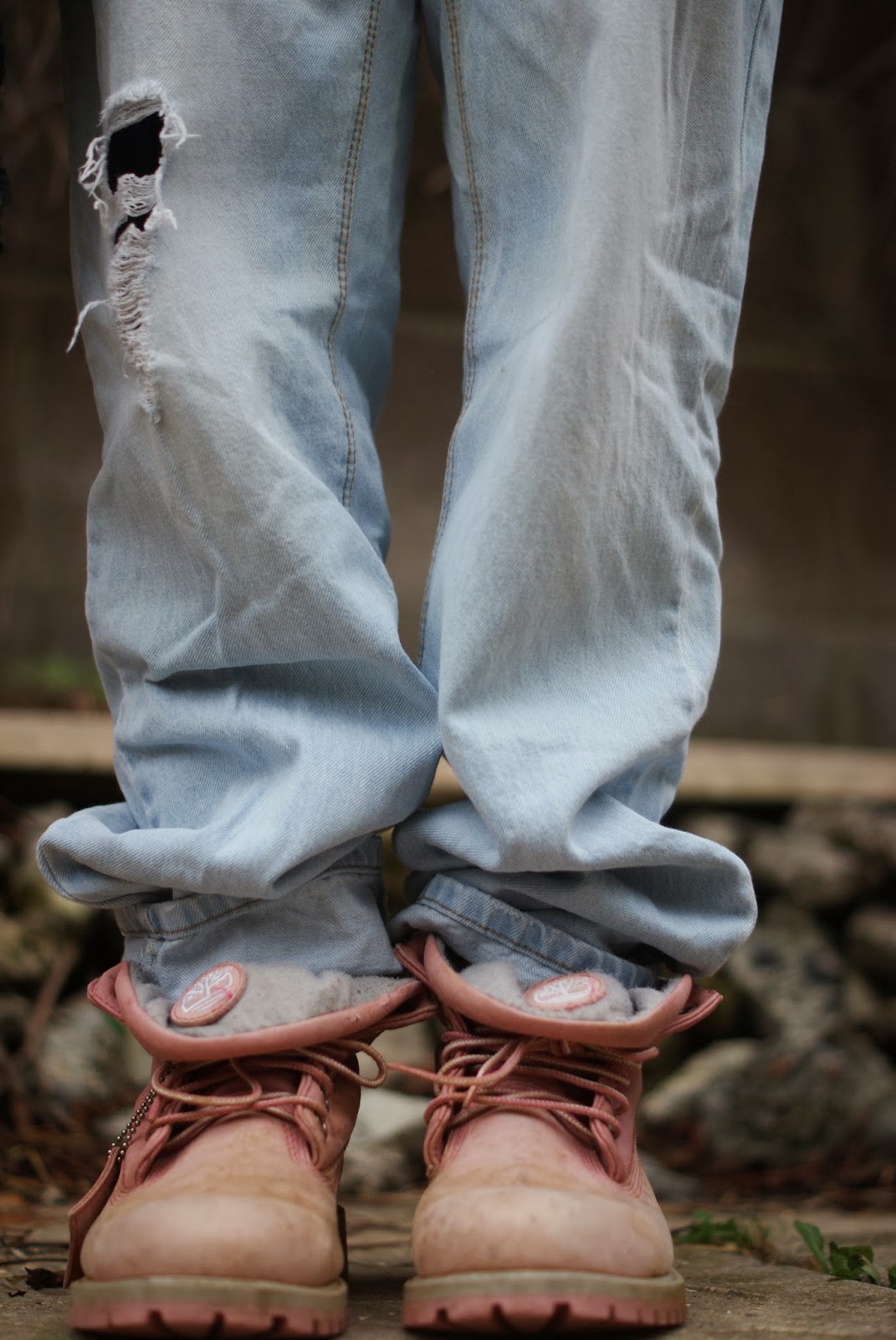


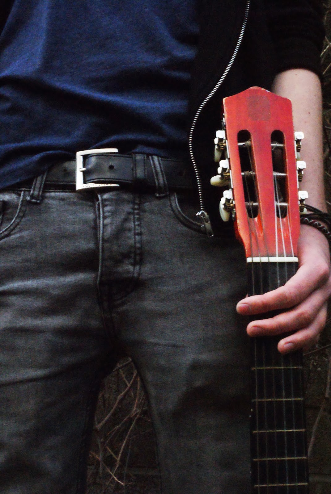


.jpg)
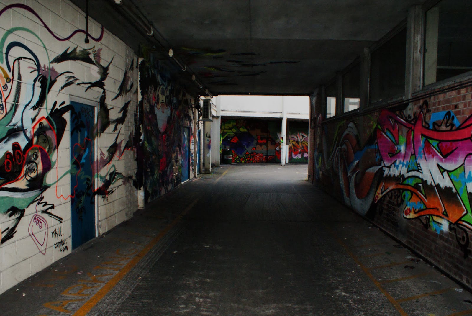

.jpg)


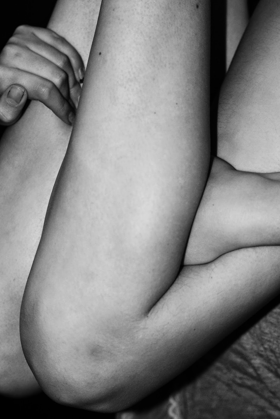
